

A lead capture form turns visitor interest into information your business can act on.
You might use one to offer a free guide, book a consultation, request a quote, register someone for a webinar, or start a sales conversation. The right form depends on what you’re offering and what your team needs to do after someone submits it.
The exchange sounds simple.
But forms often create unnecessary friction. A vague headline, too many fields, weak CTA copy, confusing errors, or a poor mobile experience can make visitors leave before they submit.
An effective lead capture form gives people a clear reason to act, asks for information that serves a real purpose, and makes the next step obvious.
And the shortest form isn’t automatically the best form.
A serious sales inquiry may need more information than a newsletter signup, especially when your team needs to qualify the lead before someone follows up.
At Gutena Forms, we build WordPress form tools, so we see many of the same problems that make forms harder to complete: unnecessary fields, unclear validation, weak spam controls, and poor post-submission workflows.
This guide covers 17 lead capture form best practices, along with accessibility tips, spam prevention, WordPress implementation advice, lead attribution, and ways to measure form performance.
What Is a Lead Capture Form?
A lead capture form, also called a lead generation form or lead form, collects information from people who show interest in a product, service, offer, or business.
Businesses use these forms to generate leads, qualify prospects, build email lists, and start follow-up conversations.
Common lead capture form fields include:
- Name
- Email address
- Phone number
- Company name
- Job title
- Business size
- Product or service interest
- Project requirements
- Budget range
- Preferred contact method
The information you request should connect to a specific business or marketing purpose.
Don’t add fields simply because your form builder makes them available.
For example, a newsletter signup may only need an email address, while a B2B consultation form may need a company name, job role, project details, and preferred contact method.
Lead qualification means assessing whether a lead fits your ideal customer profile and has a realistic need for your product or service. A form can collect useful qualification data such as company size, job role, budget, timeline, or service interest, but every extra question should have a clear purpose.
Lead Capture Form vs. Contact Form
These forms can look similar, but they usually serve different purposes.
A contact form usually gives visitors a way to ask a question, request support, or start a conversation with a business.
A lead capture form focuses more directly on collecting information that supports marketing, sales, qualification, or follow-up.
For example, a contact form might ask for a name, email address, and message.
A lead capture form for a software demo might also ask for a company name, job title, team size, or product interest because your sales team may need that information before the follow-up conversation.
The distinction isn’t absolute.
A contact form can generate leads, and a lead generation form can handle customer inquiries.
What matters most is what you plan to do with the information after someone submits the form.
What Makes a Lead Capture Form Effective?
Good lead capture form design isn’t about making a form look attractive.
It combines clear messaging, useful fields, accessibility, trust, and a straightforward path to submission; the form should feel like a natural next step rather than another task visitors have to figure out.
A form that converts well isn’t necessarily the shortest form, either.
A strong lead capture form balances conversion rate, lead quality, user experience, accessibility, and the information your sales or marketing team needs for lead qualification and follow-up.
Before adding another field, ask one question:
What will we do with this information?
If you don’t have a clear answer, the field probably doesn’t belong on the first interaction.
17 Lead Capture Form Best Practices
Building an effective lead capture form takes more than adding a few fields and a submit button.
You need to balance conversion goals with lead quality, user experience, trust, accessibility, and the information your business actually needs.
These 17 lead capture form best practices can help you create forms that reduce friction without stripping away the information your team needs.
1. Match the Form to the Offer
Your form should make sense in the context of what you’re offering.
A newsletter signup doesn’t need the same information as a sales qualification form, and a downloadable checklist shouldn’t ask the same questions as a consultation request.
Start with the offer.
Then decide what information you actually need.
| Offer | Likely Form Fields |
| Newsletter | Email address |
| Ebook or checklist | Name and email |
| Webinar | Name, email, company |
| Product demo | Name, email, company, role |
| Consultation | Name, email, phone, project details |
| Quote request | Contact details, service, project requirements |
Each offer has different requirements.
The right number of fields depends on the offer, visitor intent, and what your team needs to do next.
2. Give Visitors a Clear Reason to Submit
People don’t submit forms because forms exist.
They submit because they expect something useful afterward.
Make that exchange obvious.
Tell visitors what they’ll receive and, when appropriate, how they’ll receive it.
For example:
- Download the free pricing guide
- Get the checklist by email
- Request your free consultation
- See the product demo
- Join the weekly newsletter
- Get a custom quote
And keep the explanation close to the form.
If visitors have to search the page to understand what happens after clicking the button, you’ve added unnecessary friction.
The offer should answer a simple question:
What’s in it for me?
3. Keep the Form as Short as the Goal Allows
Shorter forms often require less effort.
But don’t turn “keep it short” into a rule that forces every form to contain only two fields, because a business that needs project information to qualify a serious inquiry may benefit from asking for more information upfront.
Typeform’s analysis of more than 10,000 customer forms found that 10-question forms averaged 28% lower completion rates than three-question forms. Typeform’s 2025 Lead Capture Form Report
That doesn’t mean every three-question form will outperform a longer one. Your offer, audience, traffic source, and lead qualification process all affect how much information visitors are willing to provide.
So remove unnecessary fields first.
Don’t remove useful fields simply because a shorter form looks better on paper.
A newsletter signup may need one field. A serious B2B sales inquiry may need five or six.
The goal isn’t the lowest field count. It’s the lowest unnecessary effort.
4. Ask for Essential Information First
Don’t make visitors answer unnecessary questions before they reach the information your business actually needs.
For many lead capture forms, an email address belongs near the start of the form because it gives your team a practical way to follow up.
But the right field order depends on the offer, visitor intent, and what you need to do next.
If you need more information later, consider collecting it after you’ve established the initial relationship.
This approach can support progressive profiling: collect a few useful details during the first interaction, then request additional information during later interactions when visitors have more reason to provide it.
And don’t ask for information simply because your CRM has a field for it.
Every field should earn its place.
5. Use Clear, Descriptive Field Labels
Visitors shouldn’t have to guess what you want.
Use labels that describe the information clearly:
- Full name
- Work email address
- Phone number
- Company name
- Project budget
- What can we help you with?
Avoid labels that force visitors to interpret your intent.
For example, “Contact” could mean an email address, phone number, or preferred contact method.
“Details” could mean almost anything.
Use short helper text when a field needs additional context.
Don’t make placeholder text do all the work, either; users can lose that information as soon as they start typing, while a proper label remains available throughout the interaction.
6. Write Benefit-Focused CTA Copy
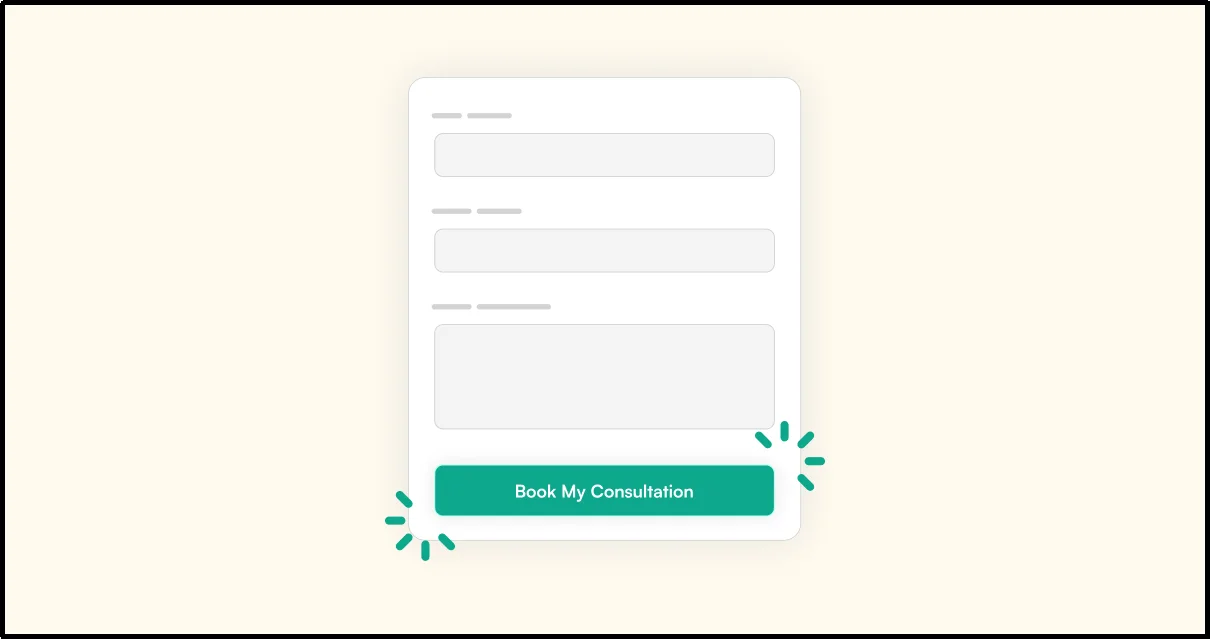
“Submit” tells visitors what the button does.
It doesn’t tell them why they should click it.
Use CTA copy that describes the action or benefit:
- Get the Free Guide
- Request a Quote
- Book My Consultation
- Start My Free Trial
- Download the Checklist
- Get Product Updates
The best CTA depends on the offer.
Don’t force clever wording where simple clarity works better.
And make sure the button still makes sense when someone scans the form quickly.
A visitor should understand what will happen after the click.
7. Use a Logical Visual Hierarchy
A lead capture form should guide visitors from one decision to the next.
Keep related elements together:
- Form headline
- Short explanation of the offer
- Relevant fields
- Privacy or consent information
- Primary CTA
Don’t bury the form beneath large blocks of unrelated copy.
Use adequate spacing, readable text, visible labels, and clear focus states; the form should look like part of the page rather than an unrelated widget dropped into the middle of it.
Good design reduces the amount of mental work required to complete the form.
8. Place Forms Where Visitor Intent Is Highest
Form placement matters because visitors don’t have the same level of intent everywhere on a page.
Consider placing a form:
- Beside a lead magnet
- Near a product comparison
- After explaining a service
- At the end of a detailed sales page
- Inside a dedicated landing page
- Near a relevant CTA
- Within a webinar or event registration page
Don’t automatically place the same form in every sidebar and footer.
Match placement to intent.
A visitor reading a detailed service page may be ready for a consultation form, while someone arriving on a general blog post may need more context before you ask for a sales inquiry.
9. Use Multi-Step Forms for Complex Qualification
Long forms can feel intimidating when every field appears at once.
Instead of presenting 10 or 15 fields in one large block, break a genuinely complex process into logical steps when it makes the experience easier to understand.
For example:
- Step 1: Contact information
- Step 2: Project requirements
- Step 3: Budget and timeline
- Step 4: Additional details
But don’t assume multi-step forms automatically convert better.
Test the format against your audience, offer, and lead-quality goals; a short one-step form may work better for a simple offer, while a structured multi-step experience can make a complex qualification process easier to handle.
Show visitors their progress when the process contains several steps.
A progress indicator can also reduce uncertainty because visitors can see how much work remains.
If you are using Gutena Forms, you can create multi-step forms using the Step Break field.
10. Use Conditional Logic to Personalize the Experience
Not every visitor needs to see every question.
Conditional logic lets a form display relevant fields based on previous answers.
For example:
What do you need?
- Website design
- SEO services
- Content writing
- Something else
If the visitor chooses SEO services, the next question could ask about current website traffic or SEO goals.
Someone choosing content writing could see questions about content type and publishing frequency instead.
That’s a better experience than forcing everyone through the same questionnaire.
For longer qualification journeys, progressive profiling can take this further by collecting additional information over multiple interactions rather than asking for everything at once.
11. Build Trust With Privacy and Security Information
Visitors are giving you personal information.
Tell them what happens next.
Depending on the data you collect, why you collect it, where you operate, and which laws apply to your business, you may need to provide privacy information or obtain consent for certain types of communication.
Don’t assume that one consent checkbox covers every purpose.
Keep required information and optional marketing choices clearly separated.
For example:
We’ll use your information to respond to your request. If you’d also like to receive marketing emails, select the optional checkbox below.
Don’t hide important privacy information in tiny text.
And don’t treat a generic privacy statement as a substitute for understanding the requirements that apply to your business.
12. Design for Mobile Users
A form that works on a desktop screen can still frustrate mobile visitors.
Test the actual experience on smaller screens.
Check:
- Field width
- Text size
- Button size
- Spacing between fields
- Keyboard behavior
- Dropdown controls
- Error messages
- Checkbox interaction
- Multi-step navigation
- Page speed
- Confirmation behavior
Use appropriate HTML input types where they make sense.
For example, use type=”email” for email addresses and type=”tel” for phone numbers; these input types can also trigger more suitable mobile keyboards.
Where appropriate, use valid HTML autocomplete values such as name, email, tel, and address-related values.
These attributes help browsers identify the purpose of common fields and can reduce the amount of typing users need to do.
Mobile testing should be part of every form launch.
13. Make Your Form Accessible
Accessibility should start during form design, not after launch.
Use descriptive labels and associate each label with its form control in the HTML.
For example, a <label> should point to the matching input with the for and id attributes.
This helps browsers and assistive technologies identify each field and its purpose.
Provide instructions where visitors need them.
Identify required fields clearly.
Make sure people can navigate the form with a keyboard.
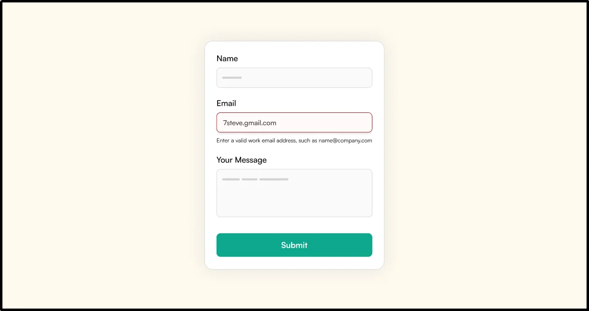
Also check your error experience.
When someone makes a mistake, the form should explain what went wrong and how to fix it.
Weak: Invalid input.
Better: Enter a valid work email address, such as name@company.com.
Where appropriate, use autocomplete attributes to identify the purpose of common input fields.
Accessibility isn’t just about compliance.
It also makes forms easier to understand and use.
14. Prevent Spam Without Adding Unnecessary Friction
Lead forms attract more than genuine prospects.
Bots find them, too.
Use spam protection that fits the risk level of your form.
Depending on your setup, you might use:
- Honeypot fields
- Google reCAPTCHA
- Cloudflare Turnstile
- Rate limiting
- Server-side validation
- Other security controls appropriate to your site
Gutena Forms supports Google reCAPTCHA, Cloudflare Turnstile, and Honeypot protection as built-in anti-spam options.
Server-side validation isn’t a replacement for dedicated bot protection.
It helps your application reject invalid or unexpected data after a request reaches your server, while dedicated anti-spam controls can help identify or block automated submissions.
Don’t add several layers of friction simply because they’re available.
Start with the protection your form needs, monitor spam, and adjust when necessary.
15. Make Errors Easy to Understand and Fix
Errors shouldn’t leave visitors staring at a red message wondering what they did wrong.
Give them three things:
- What happened
- Where it happened
- What they should do next
For example:
Please enter your phone number.
That’s more useful than:
Invalid field.
Also identify the field that contains the error instead of relying only on color or a generic message.
Preserve the information visitors already entered whenever possible.
Nobody wants to complete eight fields and then lose everything because one field contains an error.
Client-side validation can improve the user experience, but it shouldn’t act as your only security control.
Validate submitted data on the server as well because client-side checks can be bypassed.
16. Optimize the Post-Submission Experience
The form doesn’t end when someone clicks the button.
That’s where the next part of your workflow begins.
A useful confirmation experience can include:
- A clear success message
- A promised download
- A confirmation email
- Next-step instructions
- A booking link
- Expected response time
- Relevant product or service information
For example:
Thanks! Your consultation request is in. We’ll review your details and contact you within one business day.
That’s much more useful than:
Your form was submitted.
For resource-based offers, give visitors the promised ebook, checklist, download, or next-step instructions according to your workflow.
Gutena Forms supports custom confirmation messages, redirects, email notifications, and form-entry management, giving WordPress site owners tools to manage what happens after a form submission.
17. Test, Measure, and Improve Continuously
Don’t decide that your form works because it looks good.
Measure what happens.
Useful metrics include:
- Form views
- Form starts
- Completed submissions
- Completion rate
- Abandonment rate
- Average time to complete
- Drop-off by field or step
- Qualified leads
- Lead-to-customer rate
- Spam submissions
- Conversion rate by traffic source
- Conversion rate by device
Track form conversion rate alongside lead quality, form abandonment, traffic source, device type, and lead-to-customer rate to understand which changes actually improve business results.
When possible, test one meaningful change at a time so you can better understand what caused the result.
For example, compare:
Version A: Get the Free Guide
Version B: Download My Free Guide
Or test:
Version A: 6 fields
Version B: 4 fields
Don’t judge a test after a handful of submissions.
Compare results over a meaningful period and with enough data to avoid treating random fluctuations as a winning variation.
The goal isn’t simply more submissions.
It’s better outcomes.
Don’t Optimize for Submissions Alone
A form that generates 500 low-quality submissions may be less useful than one that generates 100 qualified leads.
Look beyond the submission count.
Compare completion rate with qualified leads, sales conversations, and eventual customers; if removing a field increases submissions but reduces lead quality, the change may hurt the business even though the form performs better on paper.
And this is where lead qualification matters.
A good lead capture form should help your business collect enough information to decide what happens next without making visitors complete a sales questionnaire before they’ve shown enough interest.
Focus on useful leads, not vanity numbers.
Preserve Lead Attribution Data
If you rely on forms for marketing or sales, consider preserving useful attribution data such as the landing page, campaign, referral source, or UTM parameters.
This information can help you understand which campaigns generate leads and which sources produce qualified customers.
For example, you might discover that one campaign produces twice as many form submissions but another campaign produces far more customers.
Without attribution data, that difference can stay hidden.
Your form should support the reporting process, not become a dead end after submission.
How to Create a Lead Capture Form
Once you’ve defined your offer and audience, you can build the form around the actual conversion journey.
Follow this process:
- Define the Offer – Decide what visitors will receive in exchange for their information.
- Decide What Information You Need – Separate essential information from information that would merely be convenient to have.
- Choose the Fields – Add only the fields that support the offer, qualification process, or follow-up workflow.
- Write the Form Headline – Explain what visitors can get or accomplish.
- Write the CTA – Use clear action-oriented language that matches the offer.
- Add Trust and Privacy Information – Explain relevant data-use practices and separate optional marketing consent from required information where applicable.
- Configure Validation and Spam Protection – Use helpful validation messages and an appropriate anti-spam method.
- Configure the Confirmation Experience – Decide what happens immediately after submission.
- Set Up Notifications and Lead Management – Make sure the right person or system receives the submission and that the lead doesn’t disappear into an inbox.
- Test the Entire Experience – Test the form on desktop and mobile, submit real test entries, trigger validation errors, check notifications, and confirm that the promised next step works.
If you’re building one in WordPress, you can also read our guide on how to create a lead generation form in WordPress.
That’s how you turn a form into a lead capture workflow rather than just another block on a page.
Lead Capture Form Examples for Different Use Cases
Different offers need different forms.
There’s no single field combination that works for every business.
| Use Case | Recommended Fields | CTA Example |
| Newsletter | Subscribe | |
| Lead Magnet | Name, email | Get the Guide |
| Product Demo | Name, email, company, role | Request a Demo |
| Sales Inquiry | Name, email, company, message | Talk to Sales |
| Consultation | Name, email, phone, service interest | Book My Consultation |
| Quote Request | Contact details, service, requirements | Request a Quote |
| Free Trial | Name, email, password | Start Free Trial |
| Webinar | Name, email, company | Reserve My Spot |
| B2B Sales Inquiry | Name, work email, company, job title, project details | Talk to Sales |
| Quiz | Relevant contact information plus quiz answers | See My Results |
| Qualification Form | Contact details plus qualification questions | Continue |
The goal isn’t to copy one of these forms exactly.
Use the structure that matches your offer, audience, and follow-up process.
For more ideas, read our guide on how to create online forms that convert.
Common Lead Capture Form Mistakes to Avoid
Before publishing your form, check that you aren’t:
- Asking for unnecessary information
- Using vague CTA copy
- Hiding the value of the offer
- Using unclear field labels
- Ignoring mobile usability
- Hiding relevant privacy information
- Using vague error messages
- Adding excessive spam protection
- Providing no confirmation after submission
- Ignoring lead follow-up
- Losing useful attribution information
- Skipping cross-device testing
- Collecting information that your team never uses
Small problems can add up.
Run through the form yourself before sending visitors to it.
Better yet, ask someone who wasn’t involved in building the form to complete it without guidance.
Watch where they hesitate.
Those moments often reveal friction that the person who built the form won’t notice.
Turn Lead Capture Into a Complete Workflow
A lead capture form is only one part of the conversion journey.
Visitor → Offer → Form → Submission → Confirmation → Lead Management → Follow-Up
The form needs to collect useful information, but your workflow also needs to deliver the promised offer, notify the right people, store the submission, preserve useful attribution data, and support timely follow-up.
That’s where form management becomes important.
For WordPress websites, your lead capture workflow can include the form itself, submission storage, email notifications, spam protection, confirmation messages, redirects, and integrations with the tools your team uses to manage leads.
Gutena Forms gives users a native WordPress Block Editor experience to build forms and manage features such as notifications, confirmations, redirects, form entries, and anti-spam protection.
Ready to build a lead capture form in WordPress? Get started with Gutena Forms.
Key Takeaways
- Match the form to the offer and visitor intent.
- Remove fields that don’t serve a clear purpose.
- Explain what visitors will receive after submission.
- Use descriptive labels and helpful error messages.
- Make forms easy to complete on mobile devices.
- Use accessible labels, keyboard navigation, and clear validation.
- Add spam protection without creating unnecessary friction.
- Preserve useful attribution data when you need campaign-level reporting.
- Measure qualified leads instead of focusing only on submission volume.
- Test the complete journey from the first click to lead follow-up.
Simple, but important.
A good lead capture form doesn’t make visitors work harder than necessary.
It gives them a clear reason to act, asks for information that serves a purpose, and makes the next step easy to understand.
Frequently Asked Questions
How short should a lead capture form be?
Keep it as short as your goal allows. Remove fields that don’t serve the offer, qualification process, or follow-up workflow, but don’t remove useful fields simply to chase a lower field count.
A newsletter form may need only an email address, while a B2B consultation form may need additional information to help your team qualify the inquiry.
What should a lead capture form CTA say?
Your CTA should tell visitors what happens when they click.
Examples include:
- Get the Free Guide
- Request a Quote
- Book My Consultation
- Start My Free Trial
- Request a Demo
Match the wording to the offer instead of using clever copy that makes the action unclear.
Where should I place a lead capture form?
Place it where visitor intent matches the action you’re asking them to take.
Lead magnets work well beside or near the promised resource, while consultation and sales forms often fit naturally on service or product pages.
Don’t assume one placement works everywhere.
Should I use a single-step or multi-step form?
It depends on the complexity of the interaction.
A short offer may work well with a single-step form, while a complex qualification process may benefit from multiple logical steps.
Test the experience instead of assuming one format will always perform better.
How can I reduce spam submissions?
Use an appropriate combination of spam controls and server-side validation.
Gutena Forms supports Google reCAPTCHA, Cloudflare Turnstile, and Honeypot protection, so WordPress site owners can choose an approach that fits their form and spam risk.
Don’t stack several anti-spam controls automatically.
Start with the protection you need and adjust it based on actual spam activity.
How do I measure whether my lead capture form works?
Start with form views, starts, submissions, completion rate, abandonment rate, qualified leads, and lead-to-customer rate.
Then compare performance by traffic source, device, landing page, and offer when you have enough data to make those comparisons useful.
If possible, track average completion time and where visitors abandon the form.
What’s the most important lead capture form best practice?
Start with the visitor’s reason for submitting.
If the offer is unclear, adding more fields, changing button colors, or moving the form around the page won’t solve the underlying problem.
Make the value clear. Then remove everything that gets in the way of the visitor receiving it.